Mining Twitter Data with Python (and JS) – Part 7: Geolocation and Interactive Maps

Geolocation is the process of identifying the geographic location of an object such as a mobile phone or a computer. Twitter allows its users to provide their location when they publish a tweet, in the form of latitude and longitude coordinates. With this information, we are ready to create some nice visualisation for our data, in the form of interactive maps.

This article briefly introduces the GeoJSON format and Leaflet.js, a nice Javascript library for interactive maps, and discusses its integration with the Twitter data we have collected in the previous parts of this tutorial (see Part 4 for details on the rugby data set).

Tutorial Table of Contents:

GeoJSON

GeoJSON is a format for encoding geographic data structures. The format supports a variety of geometric types that can be used to visualise the desired shapes onto a map. For our examples, we just need the simplest structure, a Point. A point is identified by its coordinates (latitude and longitude).

In GeoJSON, we can also represent objects such as a Feature or a FeatureCollection. The first one is basically a geometry with additional properties, while the second one is a list of features.

Our Twitter data set can be represented in GeoJSON as a FeatureCollection, where each tweet would be an individual Feature with its one geometry (the aforementioned Point).

This is how the JSON structure looks like:

{
    "type": "FeatureCollection",
    "features": [
        { 
            "type": "Feature",
            "geometry": {
                "type": "Point", 
                "coordinates": [some_latitude, some_longitude]
            },
            "properties": {
                "text": "This is sample a tweet",
                "created_at": "Sat Mar 21 12:30:00 +0000 2015"
            }
        },
        /* more tweets ... */
    ]
}

From Tweets to GeoJSON

Assuming the data are stored in a single file as described in the first chapter of this tutorial, we simply need to iterate all the tweets looking for the coordinates field, which may or may not be present. Keep in mind that you need to use coordinates, because the geo field is deprecated (see the API).

This code will read the data set, looking for tweets where the coordinates are explicitely given. Once the GeoJSON data structure is created (in the form of a Python dictionary), then the data are dumped into a file called geo_data.json:

# Tweets are stored in "fname"
with open(fname, 'r') as f:
    geo_data = {
        "type": "FeatureCollection",
        "features": []
    }
    for line in f:
        tweet = json.loads(line)
        if tweet['coordinates']:
            geo_json_feature = {
                "type": "Feature",
                "geometry": tweet['coordinates'],
                "properties": {
                    "text": tweet['text'],
                    "created_at": tweet['created_at']
                }
            }
            geo_data['features'].append(geo_json_feature)

# Save geo data
with open('geo_data.json', 'w') as fout:
    fout.write(json.dumps(geo_data, indent=4))

Interactive Maps with Leaflet.js

Leaflet.js is an open-source Javascript library for interactive maps. You can create maps with tiles of your choice (e.g. from OpenStreetMap or MapBox), and overlap interactive components.

In order to prepare a web page that will host a map, you simply need to include the library and its CSS, by putting in the head section of your document the following lines:

<link rel="stylesheet" href="http://cdnjs.cloudflare.com/ajax/libs/leaflet/0.7.3/leaflet.css" />
<script src="http://cdnjs.cloudflare.com/ajax/libs/leaflet/0.7.3/leaflet.js"></script>

Moreover, we have all our GeoJSON data in a separate file, so we want to load the data dynamically rather than manually put all the points in the map. For this purpose, we can easily play with jQuery, which we also need to include:

<script src="http://code.jquery.com/jquery-2.1.0.min.js"></script>

The map itself will be placed into a div element:

<!-- this goes in the <head> -->
<style>
#map {
    height: 600px;
}
</style>
<!-- this goes in the <body> -->
<div id="map"></div>

We’re now ready to create the map with Leaflet:

// Load the tile images from OpenStreetMap
var mytiles = L.tileLayer('http://{s}.tile.osm.org/{z}/{x}/{y}.png', {
    attribution: '&copy; <a href="http://osm.org/copyright">OpenStreetMap</a> contributors'
});
// Initialise an empty map
var map = L.map('map');
// Read the GeoJSON data with jQuery, and create a circleMarker element for each tweet
// Each tweet will be represented by a nice red dot
$.getJSON("./geo_data.json", function(data) {
    var myStyle = {
        radius: 2,
        fillColor: "red",
        color: "red",
        weight: 1,
        opacity: 1,
        fillOpacity: 1
    };

    var geojson = L.geoJson(data, {
        pointToLayer: function (feature, latlng) {
            return L.circleMarker(latlng, myStyle);
        }
    });
    geojson.addTo(map)
});
// Add the tiles to the map, and initialise the view in the middle of Europe
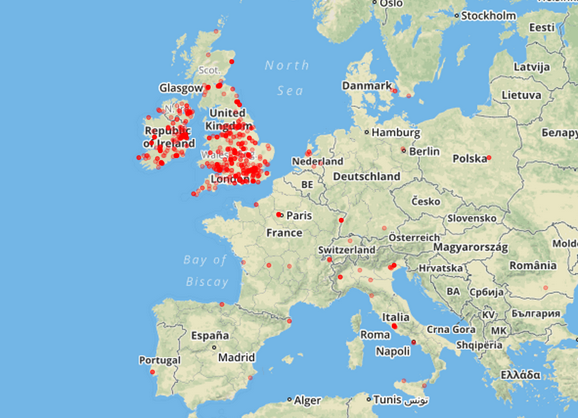
map.addLayer(mytiles).setView([50.5, 5.0], 5);

A screenshot of the results:

rugby-map-osm

The above example uses OpenStreetMap for the tile images, but Leaflet lets you choose other services. For example, in the following screenshot the tiles are coming from MapBox.

rugby-map-mapbox

You can see the interactive maps in action here:

Summary

In general there are many options for data visualisation in Python, but in terms of browser-based interaction, Javascript is also an interesting option, and the two languages can play well together. This article has shown that building a simple interactive map is a fairly straightforward process.

With a few lines of Python, we’ve been able to transform our data into a common format (GeoJSON) that can be passed onto Javascript for visualisation. Leaflet.js is a nice Javascript library that, almost out of the box, lets us create some nice interactive maps.

Tutorial Table of Contents:

@MarcoBonzanini

Mining Twitter Data with Python: Part 5 – Data Visualisation Basics

A picture is worth a thousand tweets: more often than not, designing a good visual representation of our data, can help us make sense of them and highlight interesting insights. After collecting and analysing Twitter data, the tutorial continues with some notions on data visualisation with Python.

Tutorial Table of Contents:

From Python to Javascript with Vincent

While there are some options to create plots in Python using libraries like matplotlib or ggplot, one of the coolest libraries for data visualisation is probably D3.js which is, as the name suggests, based on Javascript. D3 plays well with web standards like CSS and SVG, and allows to create some wonderful interactive visualisations.

Vincent bridges the gap between a Python back-end and a front-end that supports D3.js visualisation, allowing us to benefit from both sides. The tagline of Vincent is in fact “The data capabilities of Python. The visualization capabilities of JavaScript”. Vincent, a Python library, takes our data in Python format and translates them into Vega, a JSON-based visualisation grammar that will be used on top of D3. It sounds quite complicated, but it’s fairly simple and pythonic. You don’t have to write a line in Javascript/D3 if you don’t want to.

Firstly, let’s install Vincent:

pip install vincent

Secondly, let’s create our first plot. Using the list of most frequent terms (without hashtags) from our rugby data set, we want to plot their frequencies:

import vincent

word_freq = count_terms_only.most_common(20)
labels, freq = zip(*word_freq)
data = {'data': freq, 'x': labels}
bar = vincent.Bar(data, iter_idx='x')
bar.to_json('term_freq.json')

At this point, the file term_freq.json will contain a description of the plot that can be handed over to D3.js and Vega. A simple template (taken from Vincent resources) to visualise the plot:

&lt;html&gt;
&lt;head&gt;
    &lt;title&gt;Vega Scaffold&lt;/title&gt;
    &lt;script src="http://d3js.org/d3.v3.min.js" charset="utf-8"&gt;&lt;/script&gt;
    &lt;script src="http://d3js.org/topojson.v1.min.js"&gt;&lt;/script&gt;
    &lt;script src="http://d3js.org/d3.geo.projection.v0.min.js" charset="utf-8"&gt;&lt;/script&gt;
    &lt;script src="http://trifacta.github.com/vega/vega.js"&gt;&lt;/script&gt;
&lt;/head&gt;
&lt;body&gt;
    &lt;div id="vis"&gt;&lt;/div&gt;
&lt;/body&gt;
&lt;script type="text/javascript"&gt;
// parse a spec and create a visualization view
function parse(spec) {
  vg.parse.spec(spec, function(chart) { chart({el:"#vis"}).update(); });
}
parse("term_freq.json");
&lt;/script&gt;
&lt;/html&gt;

Save the above HTML page as chart.html and run the simple Python web server:

python -m http.server 8888 # Python 3
python -m SimpleHTTPServer 8888 # Python 2

Now you can open your browser at http://localhost:8888/chart.html and observe the result:

Term Frequencies

Notice: you could save the HTML template directly from Python with:

bar.to_json('term_freq.json', html_out=True, html_path='chart.html')

but, at least in Python 3, the output is not a well formed HTML and you’d need to manually strip some characters.

With this procedure, we can plot many different types of charts with Vincent. Let’s take a moment to browse the docs and see its capabilities.

Time Series Visualisation

Another interesting aspect of analysing data from Twitter is the possibility to observe the distribution of tweets over time. In other words, if we organise the frequencies into temporal buckets, we could observe how Twitter users react to real-time events.

One of my favourite tools for data analysis with Python is Pandas, which also has a fairly decent support for time series. As an example, let’s track the hashtag #ITAvWAL to observe what happened during the first match.

Firstly, if we haven’t done it yet, we need to install Pandas:

pip install pandas

In the main loop which reads all the tweets, we simply track the occurrences of the hashtag, i.e. we can refactor the code from the previous episodes into something similar to:

import pandas
import json

dates_ITAvWAL = []
# f is the file pointer to the JSON data set
for line in f:
    tweet = json.loads(line)
    # let's focus on hashtags only at the moment
    terms_hash = [term for term in preprocess(tweet['text']) if term.startswith('#')]
    # track when the hashtag is mentioned
    if '#itavwal' in terms_hash:
        dates_ITAvWAL.append(tweet['created_at'])

# a list of "1" to count the hashtags
ones = [1]*len(dates_ITAvWAL)
# the index of the series
idx = pandas.DatetimeIndex(dates_ITAvWAL)
# the actual series (at series of 1s for the moment)
ITAvWAL = pandas.Series(ones, index=idx)

# Resampling / bucketing
per_minute = ITAvWAL.resample('1Min', how='sum').fillna(0)

The last line is what allows us to track the frequencies over time. The series is re-sampled with intervals of 1 minute. This means all the tweets falling within a particular minute will be aggregated, more precisely they will be summed up, given how='sum'. The time index will not keep track of the seconds anymore. If there is no tweet in a particular minute, the fillna() function will fill the blanks with zeros.

To put the time series in a plot with Vincent:

time_chart = vincent.Line(ITAvWAL)
time_chart.axis_titles(x='Time', y='Freq')
time_chart.to_json('time_chart.json')

Once you embed the time_chart.json file into the HTML template discussed above, you’ll see this output:

Time Series

The interesting moments of the match are observable from the spikes in the series. The first spike just before 1pm corresponds to the first Italian try. All the other spikes between 1:30 and 2:30pm correspond to Welsh tries and show the Welsh dominance during the second half. The match was over by 2:30, so after that Twitter went quiet.

Rather than just observing one sequence at a time, we could compare different series to observe how the matches has evolved. So let’s refactor the code for the time series, keeping track of the three different hashtags #ITAvWAL, #SCOvIRE and #ENGvFRA into the corresponding pandas.Series.

# all the data together
match_data = dict(ITAvWAL=per_minute_i, SCOvIRE=per_minute_s, ENGvFRA=per_minute_e)
# we need a DataFrame, to accommodate multiple series
all_matches = pandas.DataFrame(data=match_data,
                               index=per_minute_i.index)
# Resampling as above
all_matches = all_matches.resample('1Min', how='sum').fillna(0)

# and now the plotting
time_chart = vincent.Line(all_matches[['ITAvWAL', 'SCOvIRE', 'ENGvFRA']])
time_chart.axis_titles(x='Time', y='Freq')
time_chart.legend(title='Matches')
time_chart.to_json('time_chart.json')

And the output:

time2

We can immediately observe when the different matches took place (approx 12:30-2:30, 2:30-4:30 and 5-7) and we can see how the last match had the all the attentions, especially in the end when the winner was revealed.

Summary

Data visualisation is an important discipline in the bigger context of data analysis. By supporting visual representations of our data, we can provide interesting insights. We have discussed a relatively simple option to support data visualisation with Python using Vincent. In particular, we have seen how we can easily bridge the gap between Python and a language like Javascript that offers a great tool like D3.js, one of the most important libraries for interactive visualisation. Overall, we have just scratched the surface of data visualisation, but as a starting point this should be enough to get some nice ideas going. The nature of Twitter as a medium has also encouraged a quick look into the topic of time series analysis, allowing us to mention pandas as a great Python tool.

If this article has given you some ideas for data visualisation, please leave a comment below or get in touch.

@MarcoBonzanini

Tutorial Table of Contents: